
Color theme
Available themes
Bifrost offers multiple color themes.
Teal(default)PurplePinkYellow- + More to come!
Each theme is available in both light and dark mode.
Theme usage
As a rule of thumb, use the theme matching your app logo. E.g. a service that
has a pink logo should use a pink theme.
When using theme-colors, please be aware that some colors might have certain
connotations. Therefore it is wise to evaluate if the use of theme-colors is
just for the sake of pure decoration, or if the color is used for a specific
intent or emphasis.
If you are unsure, please consult a UX-designer.
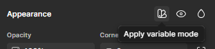
Figma
In Figma you can change theme by selecting the frame(s) you want to theme,
navigate to the appearance section in the design panel and then press the
"apply variable mode"-icon. The icon looks like a pantone fan. You can change
theme and mode when you apply variable mode.
Nesting
It is possible to nest multiple elements with different themes, in which case the inner theme will take precedence. This applies both to code and Figma.
Code demo
Elements inside a themed element will inherit theme, unless a new theme is
defined, as you may see in the demo example below.
<Box><Box><Box theme="purple">