
Intility's logo is our wordmark, recognizable by its distinctive dots. It comes in a full version and a short version for small surfaces.
Full logo
The full logo is the wordmark “Intility,” without a tagline. Use it as the default when representing the company across digital platforms, presentations and print.
Its primary color follows the --bfc-base-c variable in Bifrost, which is:
- Dark blue on light backgrounds
- Light grey on dark backgrounds
See below for special colors and where to use them.
Guidelines
Using the logo correctly is important for creating recognition and building a clear identity. Therefore, we ask that you always follow these guidelines unless you have been instructed otherwise.

Use light colored version of the logo for dark backgrounds.

Use dark colored version of the logo for light backgrounds.
Don't place the logo on a background where it blends in.

Don't use unapproved colors that are not part of the Intility brand.

Don't stretch, squash or distort the logo. Preserve its original shape.

Don't use the logo with a tagline without consulting Marketing.
Special colors
In addition to the primary colors, the logo is available in gradient versions for both dark and light backgrounds. The Bifrost contrast colors can also be used to match the logo to a theme. The special colored logos should only be used on neutral backgrounds.

Gradient logo can be used on neutral backgrounds to draw attention to the brand.
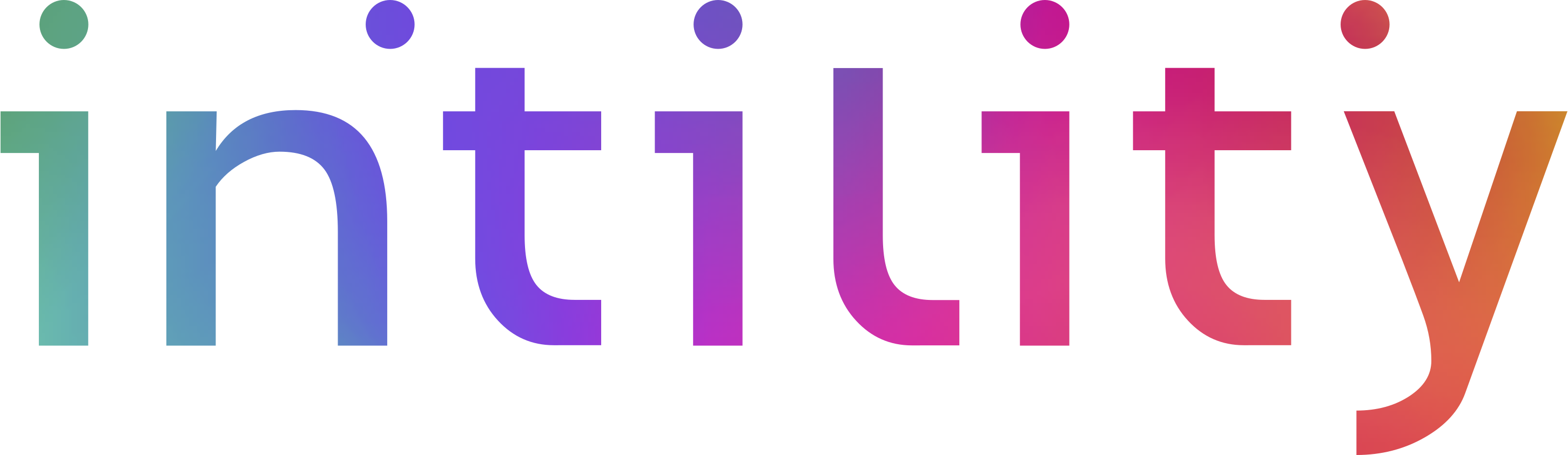
Gradient logo can be used on neutral backgrounds to draw attention to the brand.
Don't place the gradient logo on busy or photographic backgrounds.

Don't make your own gradients. Only use the predefined ones above (available in the logo package).
Bifrost contrast colors can be used to match theme, but we recommend using the primary base colors.
Black or white logo can be used in special cases where colors are not allowed.
Short logo
As a general rule, we do not use the short logo in the marketing of Intility. The exception is on small surfaces where there is not enough space for the entire logo, or where it becomes difficult to read.
A typical example of a surface where it is acceptable to use the short logo is the favicon (the small icon you see at the top of your browser tab when you visit our website). You will also see it appear in some of Intility's services, although most applications today have their own logo that should be used instead.


Download logos
Click the button below to download a package with the logo in different colors for print and digital use. If you need the short logo, please contact the Marketing department.
Contact
If you have any questions about Intility's logo, or just want to confirm that you are using it correctly, please contact the Marketing department on [email protected].